Logo
This page sets the rules for the Aimfox logo: which file to use, minimum size, backgrounds, clear space and misuse.
Logo
Logo pack
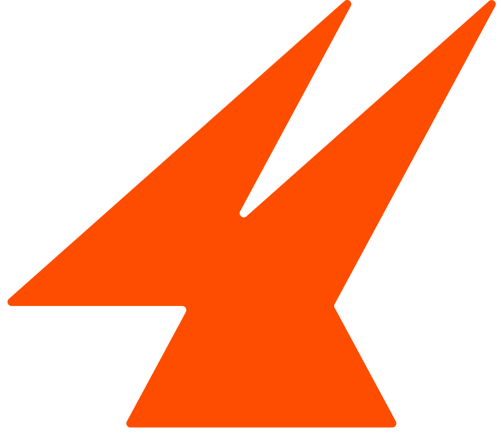
The Aimfox logo is the orange mark followed by the word “aimfox”. Use the files as they are. Do not redraw or rebuild them. Where a tool doesn’t accept SVG, you may use the PNG.
Download

Aimfox logo
Logo
Minimum size
Below a minimum size, the logo loses legibility. On screen, the logo should never be less than 24px tall. In print, the logo should never be less than 25 mm wide.
Logo
Backgrounds
Contrast with the background keeps the logo legible. On light backgrounds, use the dark logo. On dark backgrounds, use the light logo.

 Image
Logo
Clear space
Clear space keeps the logo legible by isolating it from copy, edges and other graphics. The minimum clear space on every side is half the mark’s height (x). Where there is room, use 2x.
xxMinimum clear space around the logo
Logo
Don’ts
- Do not stretch or squash the logo.
- Do not change the color of the mark.
- Do not rotate the logo.
- Do not add shadows, glows, gradients or outlines to the logo.
- Do not type the word in another font.
- Do not stack the mark above the word.
- Do not place the logo over a busy part of an image.
- Do not place the logo on an orange background.
 aimfox7
Logo
Mark
Where the logo doesn’t fit, such as in a profile picture or an app tile, you may use the mark on its own. On screen, the mark should never be less than 16px wide. Around the mark, the clear space should never be less than x.
16px24px32px48px64px App tile
The mark from 16px to an app tile
Learn more about
our programs
Creators and affiliates earn on the customers they refer. Certified experts run campaigns for Aimfox users.